Hearth is a digital tool for contractors to offer financing to their homeowner clients.
Hearth is the primary product made by Shogun Inc. My time at Shogun Inc was spent improving the Hearth existing product offering and creating new features, new vertical brands, and additional products for the company. In addition I was asked to assist with interior designs for new office spaces, marketing materials, and everything else a small startup needs from the only designer.
Have a look at a small selection of the product design wins I created for Hearth.
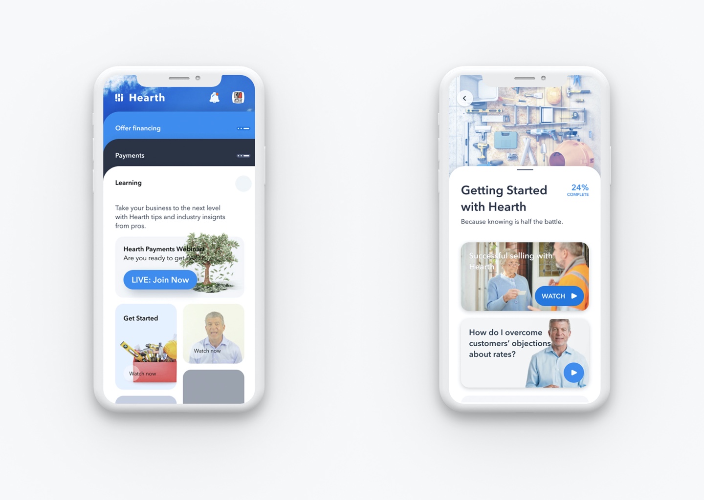
The Hearth Contractor Dashboard
The first problem: Onboarding and understanding. Previous designs were difficult to understand and saw a large drop-off where users didn’t care to finish the onboarding steps that benefit them. Shocking for a $1,000+ membership product and heavy handed individual training calls were required to get users up and running.
Solutions:
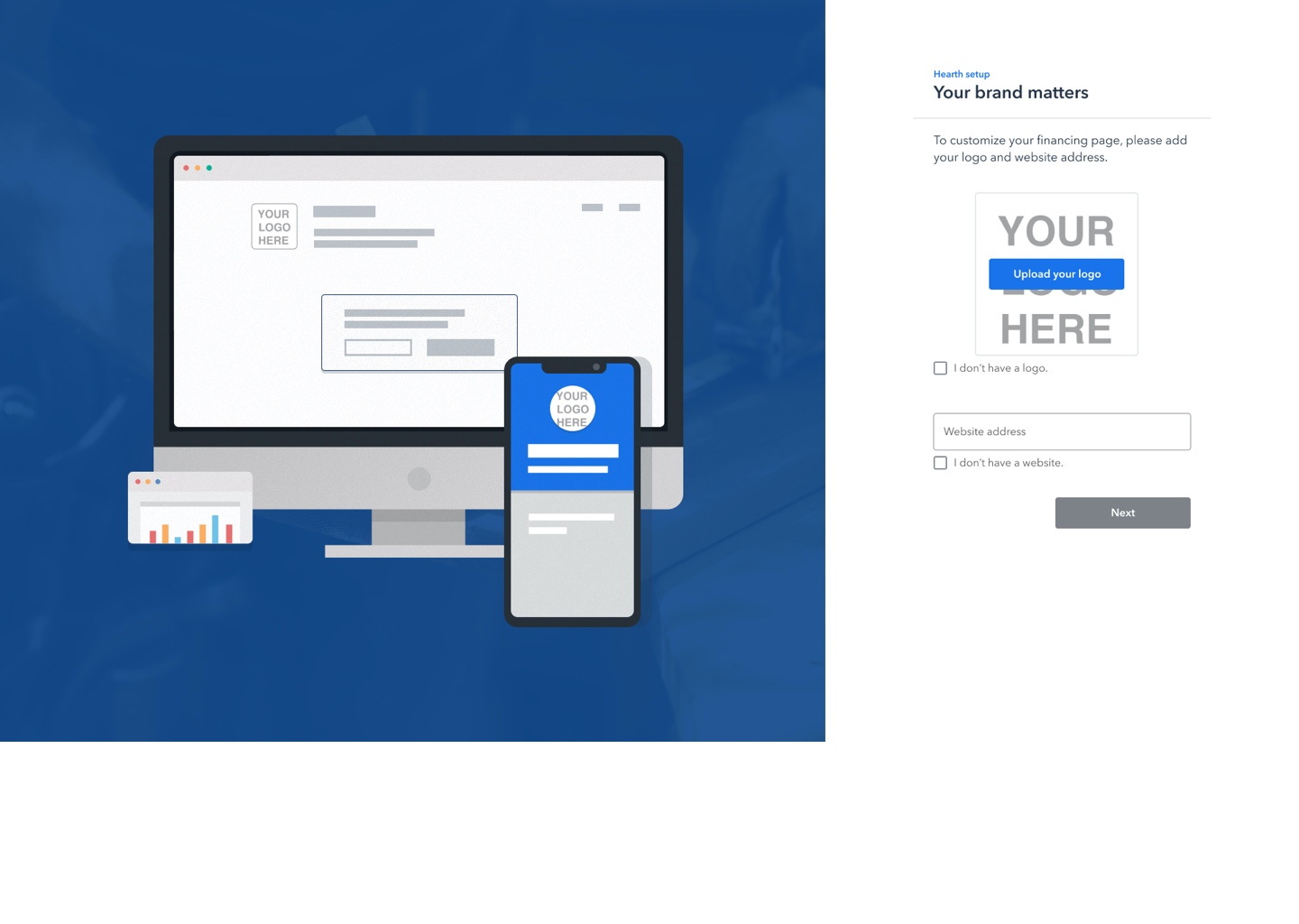
Setup step to show the value of users adding their information and logo.
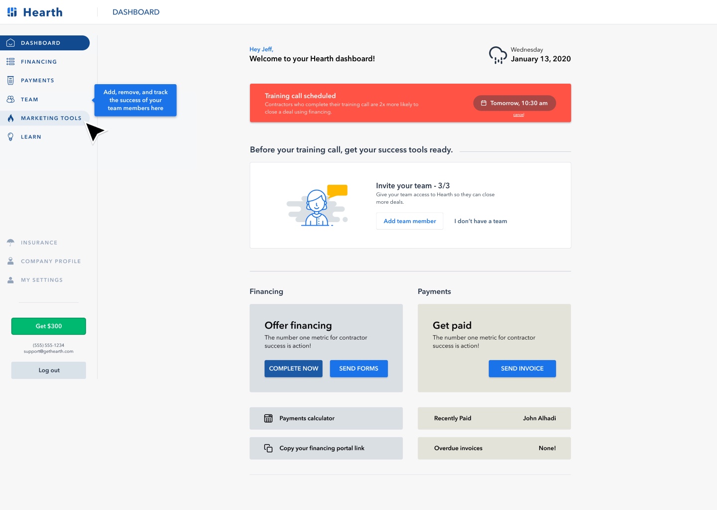
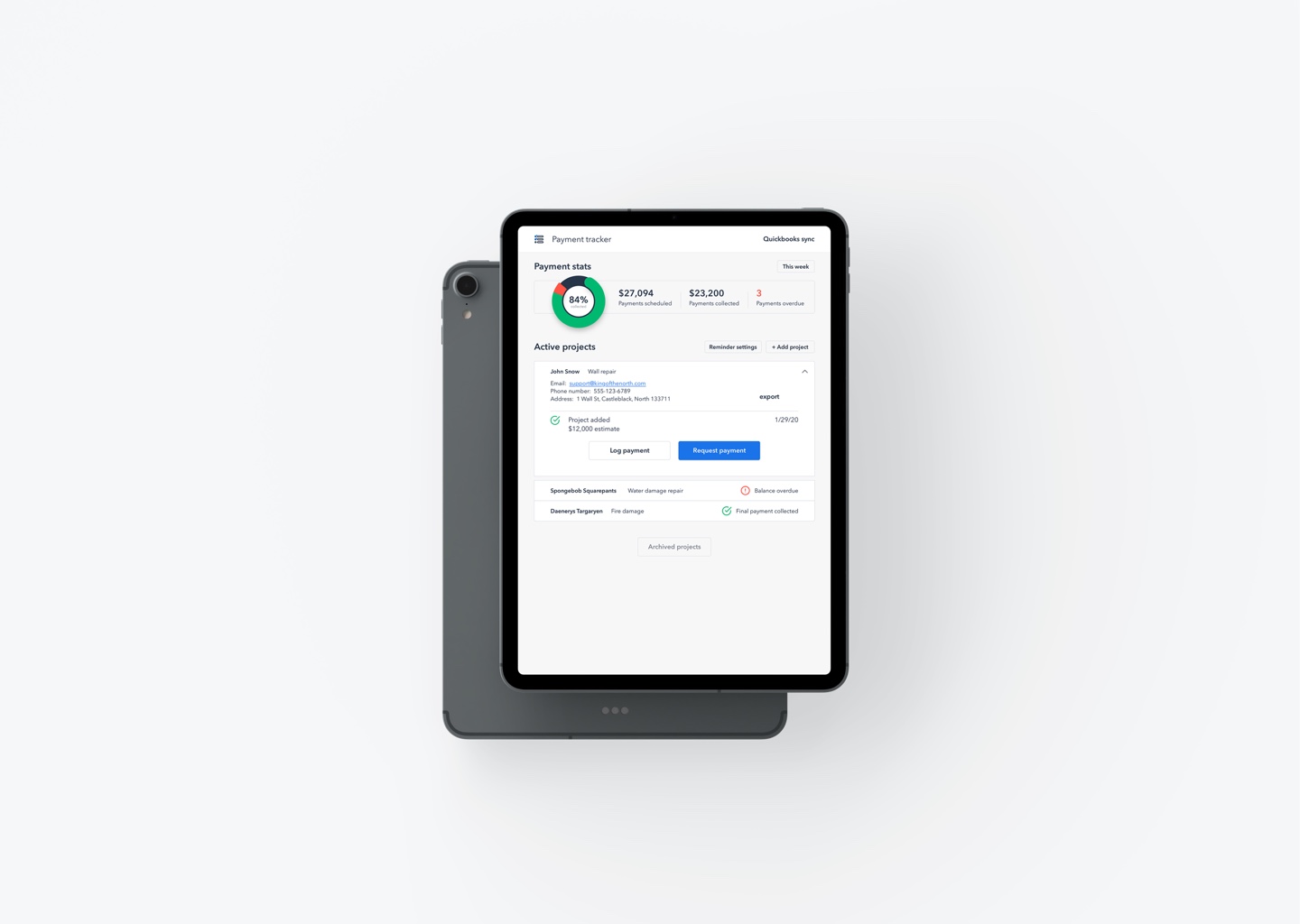
Dashboard with onboarding progression, tool tip if skipped, and details.
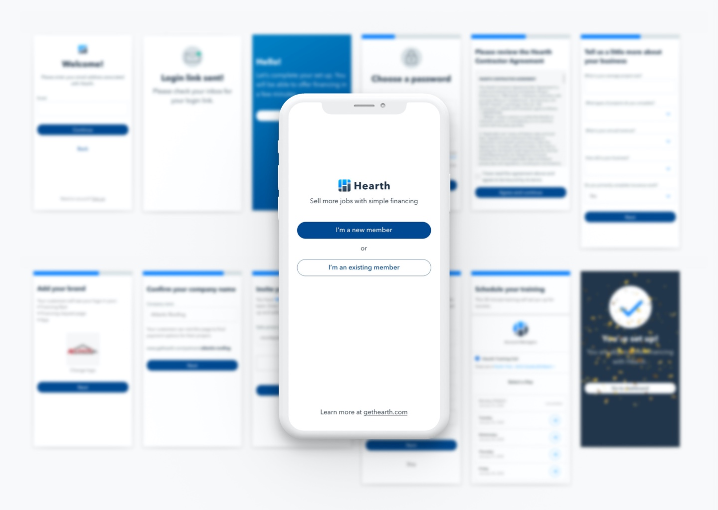
The ~100% onboarding success solution, started by removing setup from the mobile app entirely. Saving massive design and engineering time and getting the mobile product closer to what it should be, fast and easy. The web dashboard then had to do the hard part of getting new users up and running.
Research into onboarding requirements based on primary, secondary, and tertiary needs for both Hearth users and Shogun company understanding of what moves the OKR needle was done with the product team leaders. Web onboarding success was then achieved for users by creating a streamlined and focused two part process.
First the required setup portion where a user agrees to T&Cs and adds their branding which benefits them. Showing the value of each step, like adding their logo and populating it into simplified mockups of the mobile app and web views that their clients would see. This let the user get into the product and see the value they just paid for faster with the added encouragement of successfully completing setup users had more energy left to play around with the product and WANT TO complete onboarding tasks the company saw as relevant engagement metrics.
Once the quick setup steps were completed users were welcomed to their dashboard where they would have reminders of any upcoming events (like a training call) and could proceed with using the product or follow the directed calls to action. Some of those actions included getting the mobile app, inviting team members, adding a financing link to their website, and sending out their first client financing information.
Escape hatches along the way ensure there are no dead ends for any user and captured a list of needs to be followed up with.
Old
Old mobile login and setup. The details really don’t even matter it was so long.
New
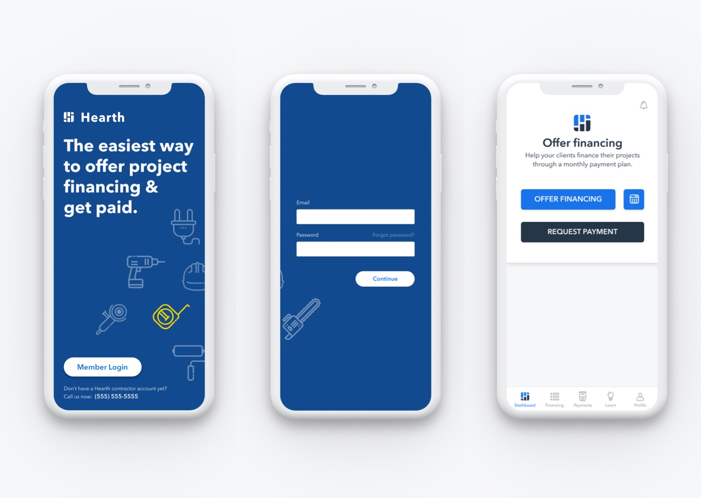
Hearth mobile app simplified setup – aka no setup, just log in and go.
Sick screen animations/transitions (not shown cause I don’t have the file anymore) built by one of the summer interns. :)
Oh, and this is while concurrently doing a full overhaul of the navigation structure and visual style upgrade for the web dashboard. Changing the wings on the plane while in flight.
Payments Product/Feature:
Previously, Hearth contractors could only offer financing to their clients. With the payments feature they could now request and accept ACH and credit card payments from the mobile app and web dashboard. From initial design concept and prototype testing through launched product and further iteration the payments product was rolled into the existing mobile and web products. This project also included communication (emails and texts) and homeowner payment portal designs.
Hearth payments prototype made in sketch/invision for user testing.
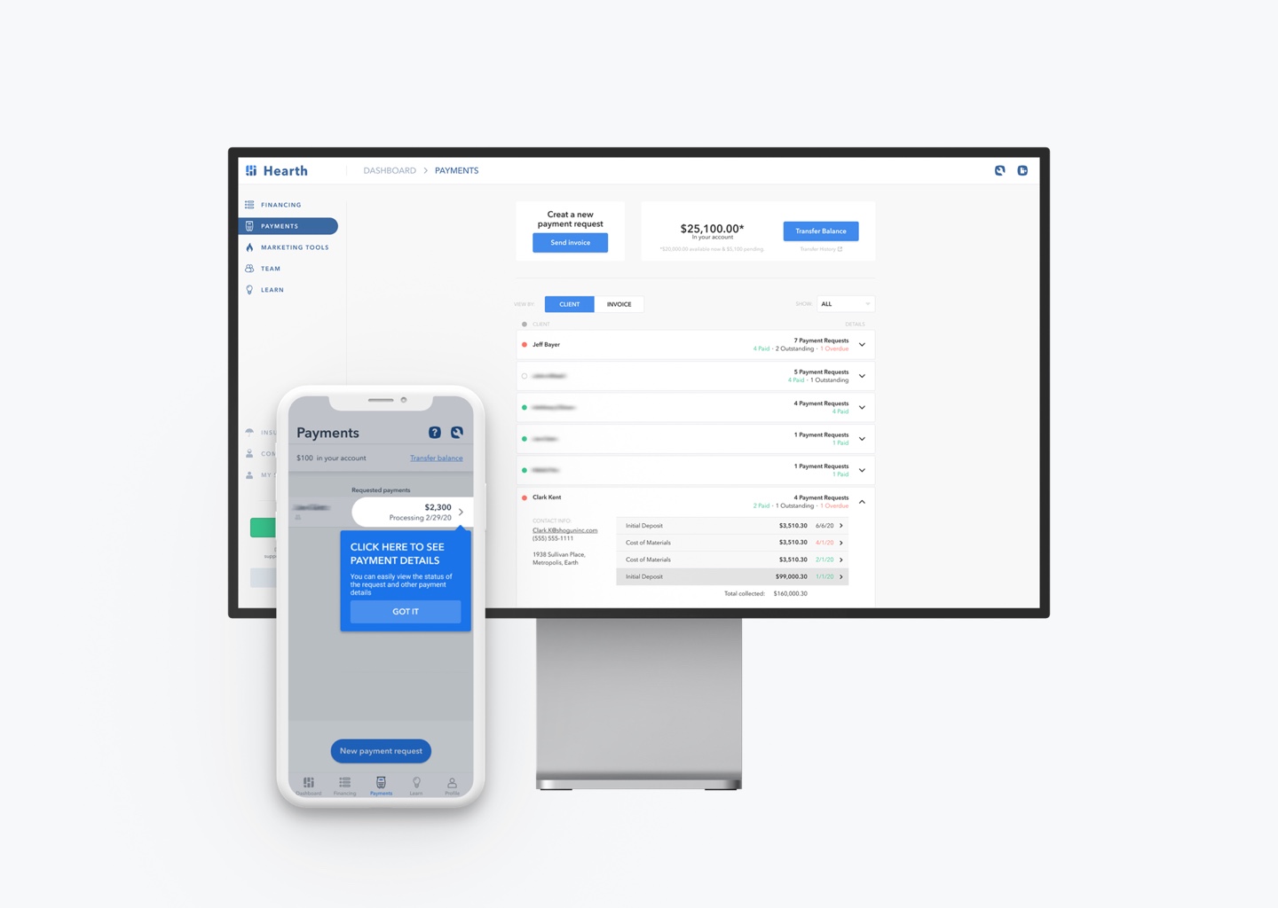
Launched mobile and full size web versions, showing some details like a helper tip and detail views. Made in Figma.
Now that the product has been proven to work, further design could go into a more seamless contractor workflow integration with the financing product and a homeowner portal that combines more the stand alone features.
The Hearth Homeowner Experience
Upgrading the Hearth homeowner experience in statistically significant and financially significant ways involved lots of research, user understanding, prototyping, testing, and iteration.
As an example, the existing homeowner financing pre-qualification flow was a process of at least 14 pages (and that was just for the homeowner, nevermind the several steps before for the contractor)! This user flow was redesigned to a conversational flow and a simple form field step for required personal data. Creating a significant increase in the flow start and complete rates. As an added bonus for engineering ease and direct company cost, the need for BlockScore (Intelligent Identity Verification) was removed. At their API price point of, at least, $0.99 per identity check… it saved a bunch of money every month.
Ongoing iterations continue with this design and wholly different ways of engaging, helping, and educating homeowners through the financing process. I look forward to seeing the new wins the Shogun team comes up with. Have a look at the old design and new designs below, including some iteration that never made it into production.
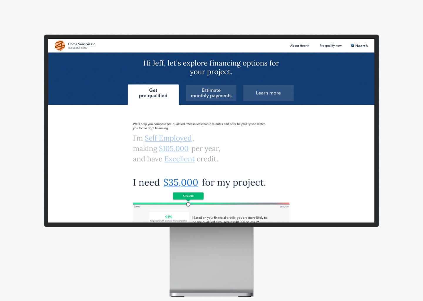
The second iteration of the conversational flow. Further versions improved on these designs.
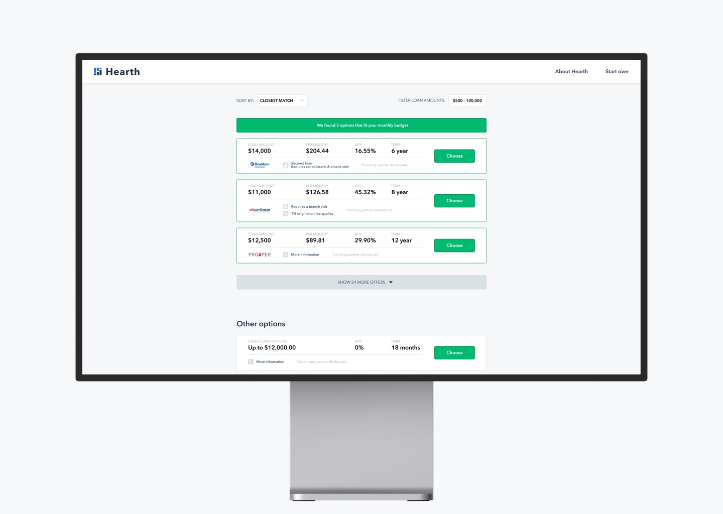
Through research and testing the financing options page was measurably improved in statistical effectiveness and user experience from previous designs.
Homeowner Payments Portal:
Another significant homeowner product feature I designed while at shogun included the homeowner payments portal for the payments product you saw earlier. This was the MVP of the product to launch it. Simply put, the simplest, 3rd (4th?) party branded, payments page. While still including all the business and legal requirements for such a page. I think this has great potential to be something better by combining it with the financing pages and other features to create a more cohesive and effective homeowner experience. And thereby elevate the contractors brand experience (powered by Hearth).
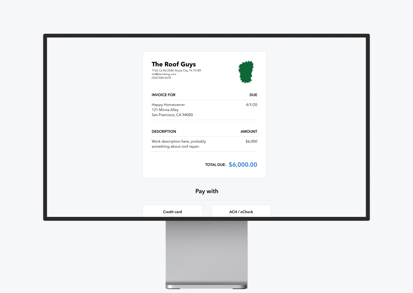
The first iteration. Future versions layered in more features and information (like itemized invoices and splitting payments for large amounts) without distracting from the simple task of paying the invoice.
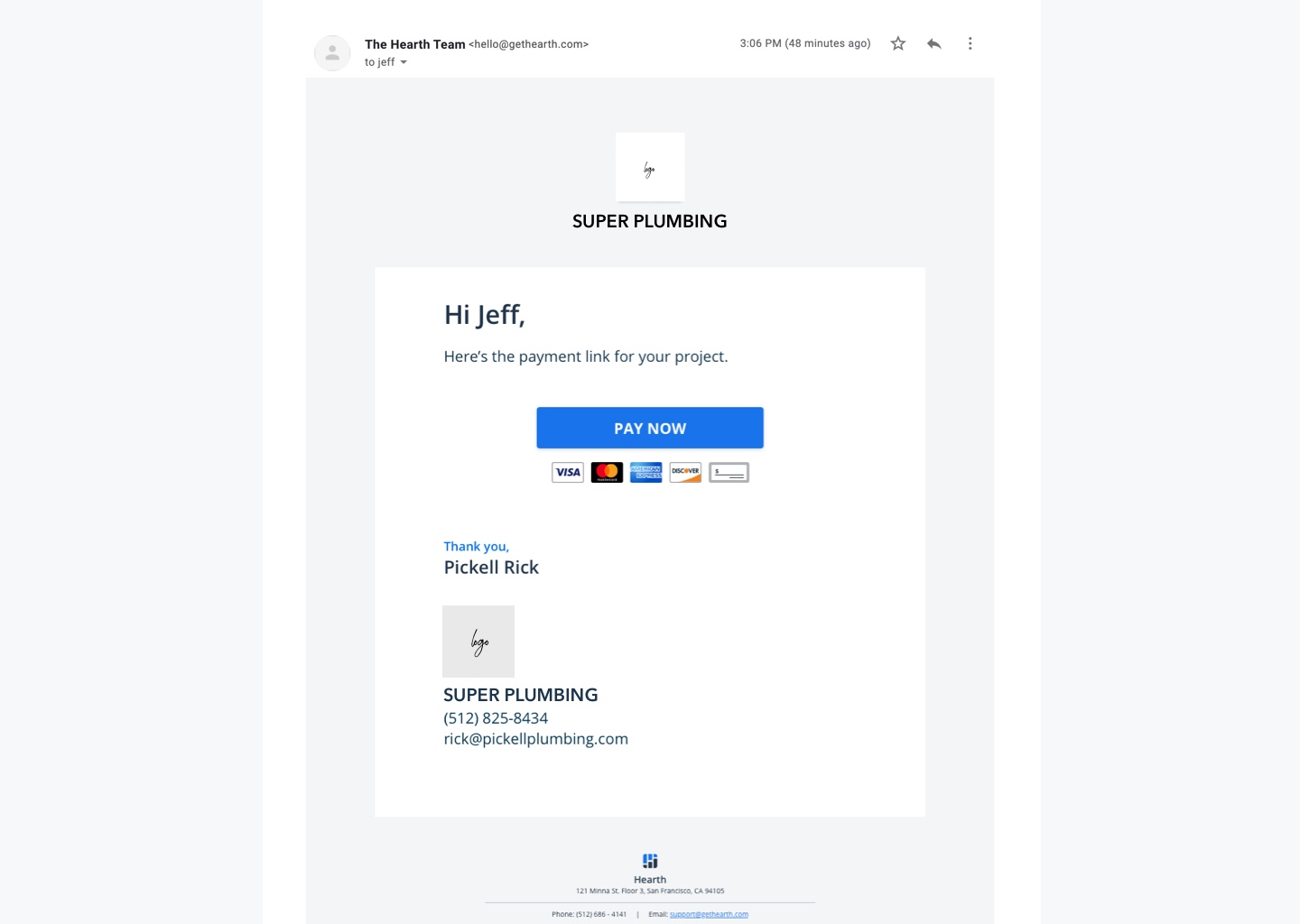
One of the emails. Others included receipts, reminders, overdue payments, financing information, and many more.
Miscellaneous Design
It’s not just user flows and research and the heavy lifting of maying the product function more effectively for the users. You have to make time for beauty, detail, and delight for your own sanity and the enjoyment of your users. Have a peak at some of the fun. :)
Gorgeous pixel perfect icons
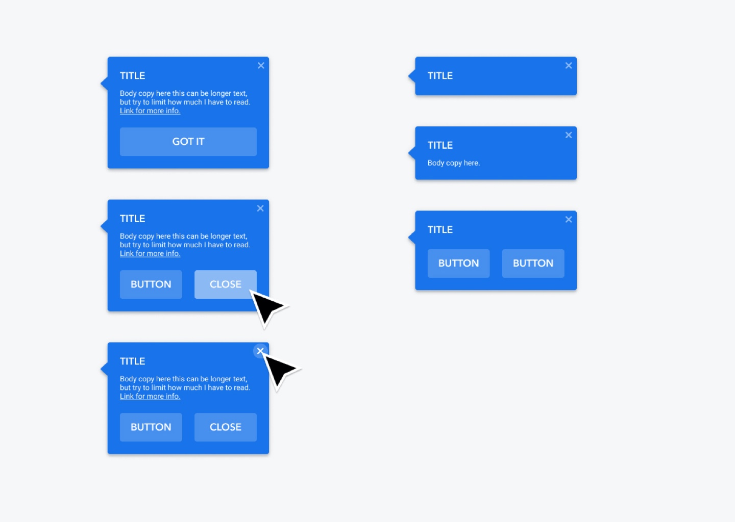
Modular design for actionable helpers.
Office interior design
Future ideation for the Hearth App